How I solved the UX complexities of a time tracking app — Detailed Case Study
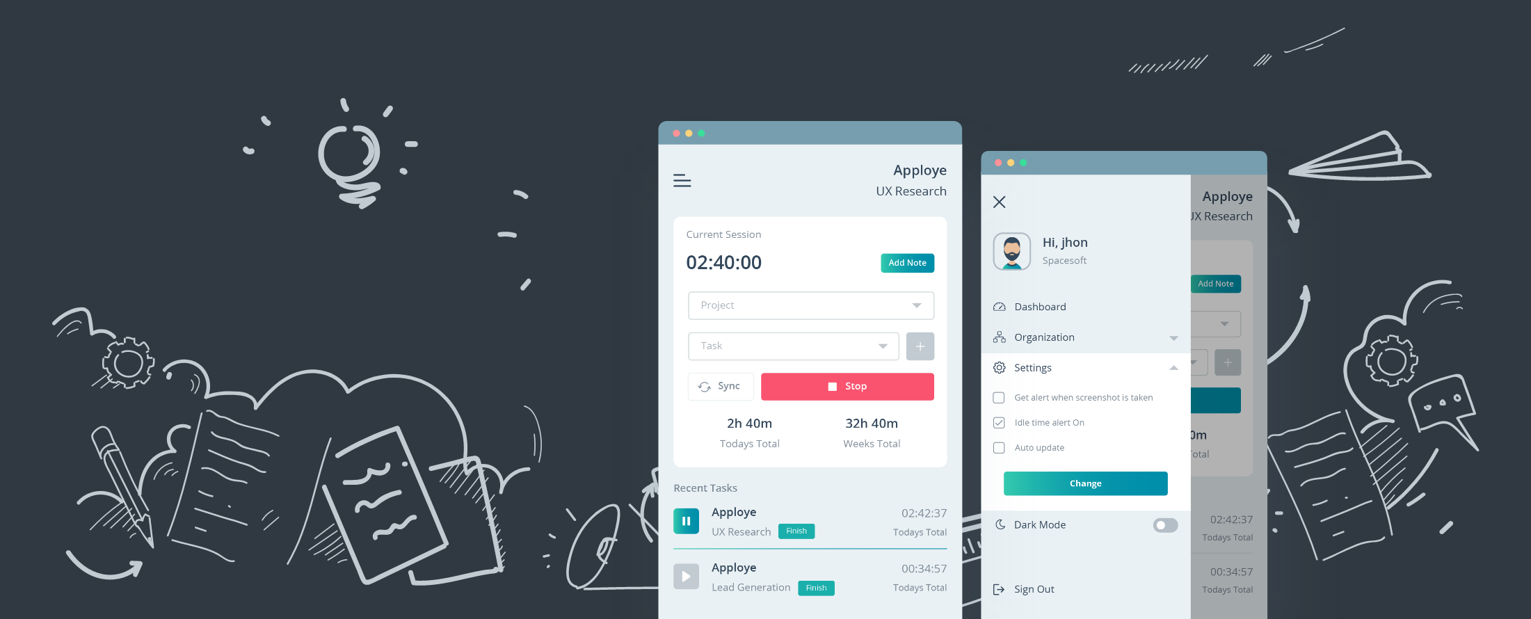
Recently, I have worked on Apploye desktop application which is a time tracking tool. This application has been redesigned and I have led the design processes entirely. Within these days, I have faced some complexities and I thought sharing my experience would bring interest to the people outside. So I decided to write a detailed case study on my recent work, Apploye desktop application.
Problems and identifications
These days, the demand for time tracking applications is at pick than ever before. Good news is there are tons of applications over the internet. However, questions arrived through many researches that, how many of them truly help people to become more productive not only just counting hours, but measuring high activity rates and many other productive features?
So we decided to redesign our desktop application and this case study will tell you the story of how Apploye born, grown and now loved by the people out there!
Facts those kill Productivity at workplace
Before we started designing, we started analyzing user problems and cases. We got highlighting points which drastically kills productivity in workplaces. We found these following keywords as the most productivity killing facts.
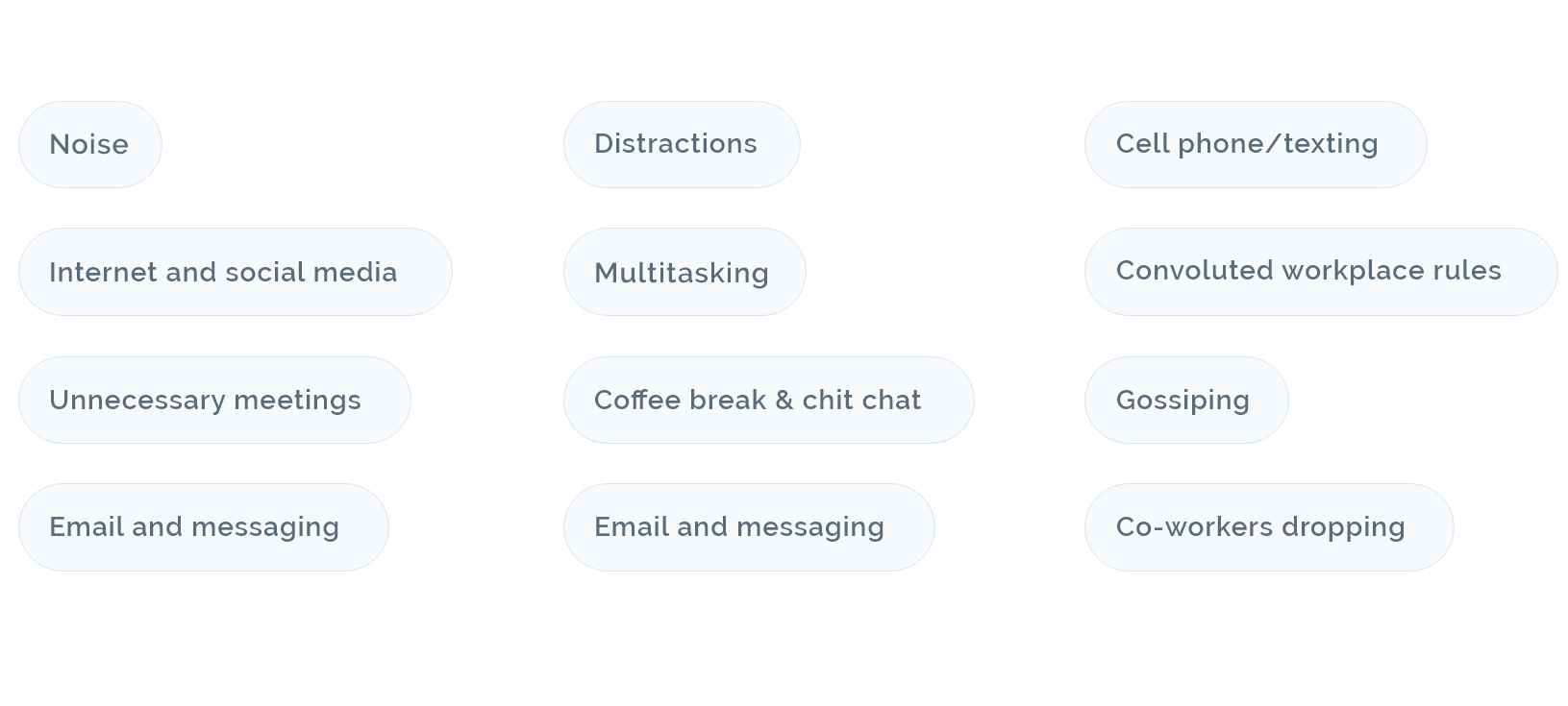
Analyzing these facts discussed above, we got a tremendous number of findings which could be resolved by a better, proper and realistic planning. These facts helped us to prepare features for Apploye desktop application and we got the real findings which can be used to improve productivity by managing time and activity. Now, before we jump to the infographic process overflow, let’s have a quick look on our features.
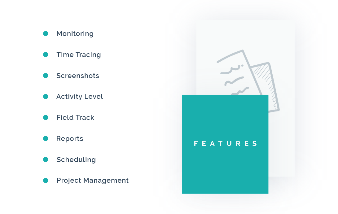
We considered these following features can help people to improve productivity while tracking time
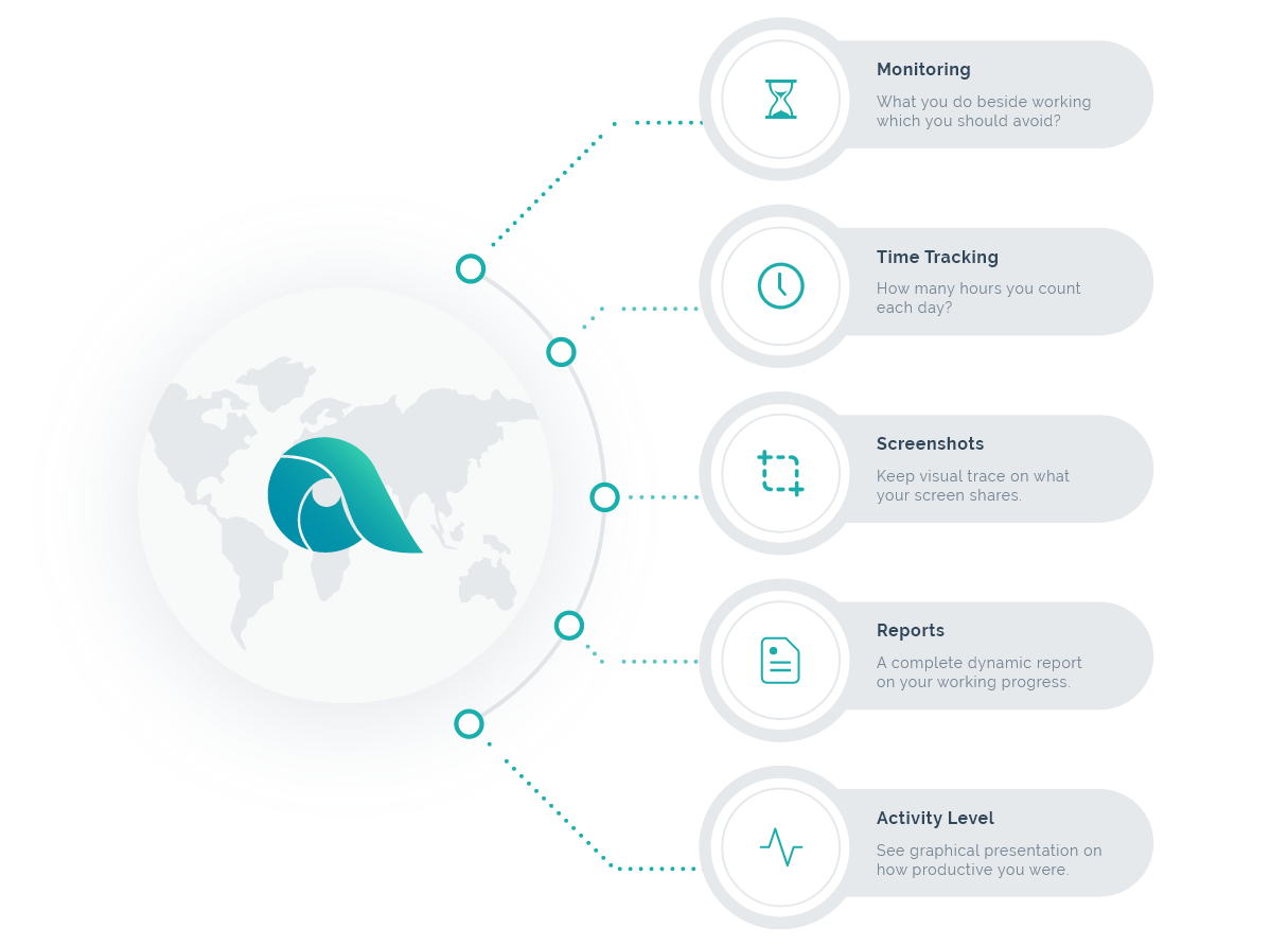
Here we are done with analyzing requirements but we faced some number of issues that caught to our head. Managing features with a smooth screen overflow and bringing the best outcome were one of our hardest challenges to be solved. We wanted to create a lucrative UI for sure, but we also wanted to give the best experience while using our application to our beloved users. Therefore, we designed the infographic process overflowing how our features will interact with each other.
Let’s share the infographic process overflow here.
We have researched 50+ of our users about their thinking on our product. Our goal was to find out the frustrations they have with time tracking software and motivations they need to overcome the obstacles discussed above. We see some people do not like using time tracking software. They have their words saying that this time tracking is actually a guesswork and this guesswork is not likely to be accurate. Some of them claim that tracking time with software and monitoring employees’ computers makes them feel monitored the way as someone is looking at him every second.
So we considered our users’ frustration to be designed in a way where an owner of the organization is getting activity rates of the employees’ as well as employees need to be relaxed whether it still tracks time.
We considered taking screenshots with having a time range facility can reduce this frustration much from the employees’ side. As these come aside, we have decided to start the sketching.
Glass Work — Sketches
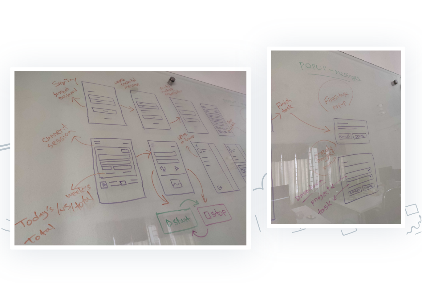
These sketches covered all the screens we needed to design. We considered the layout and most importantly, we need to make sure about having a complete feasible white space on every screen. Therefore, we took the marker pen and started drawing on the glass and the result came out in the following image how it looks.
Low Fidelity Wireframe
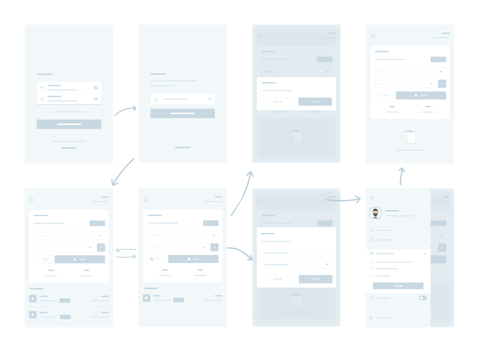
Now it’s time to start implementing all our research on digital screens. In this stage, we started designing the low fidelity wireframes before we started designing final screens. This stage created a visual glimpse of how our desktop application will look alike. We are very happy to share this here.
Showcase — Final Design Presentation
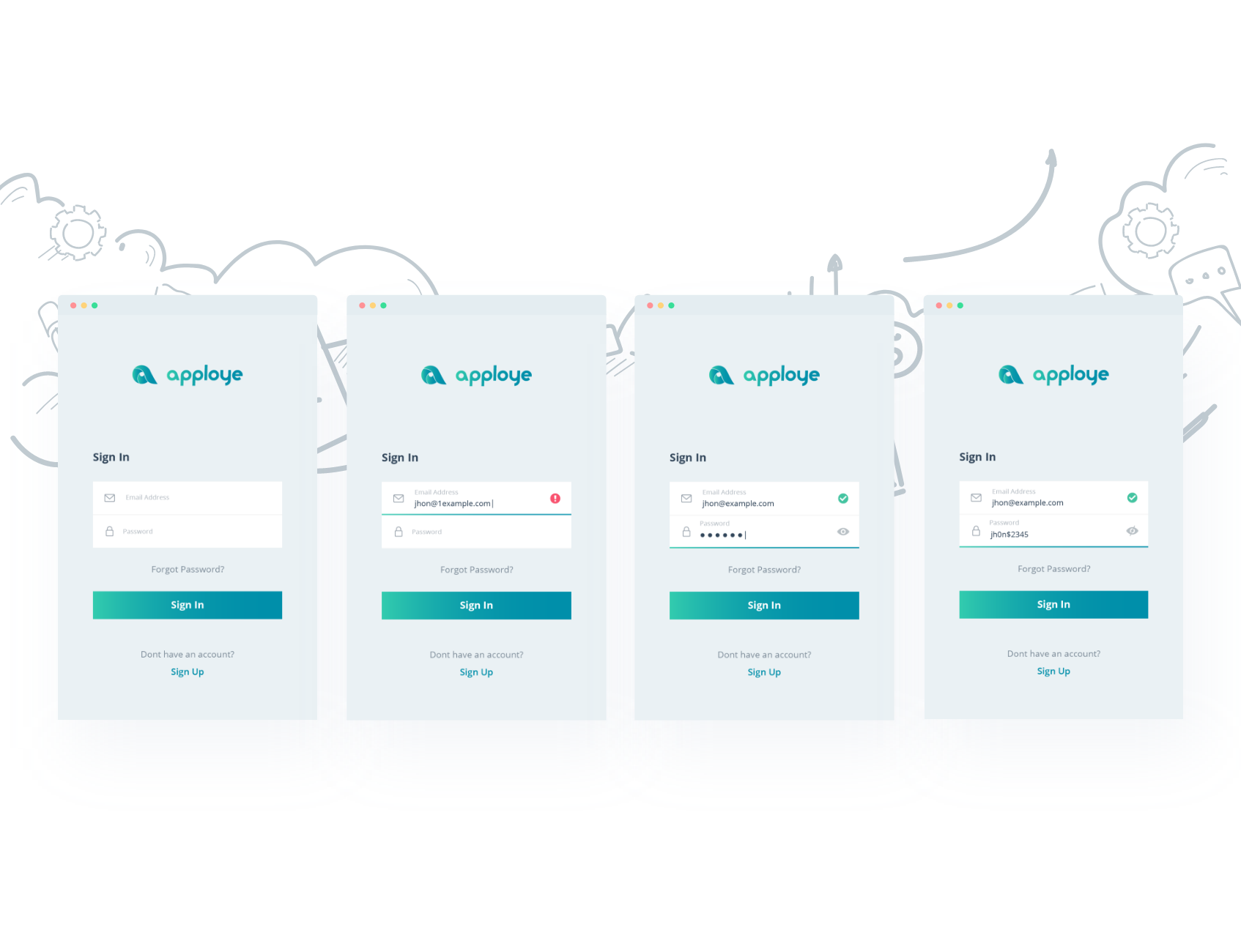
On designing the initial screens, we have provided a strong login procedure which can alert an user about a run-time alert system of a proper email validation. Users will be able to keep track of typing wrong email addresses. Unlocking the view of password is another one which helps users showing the password characters.
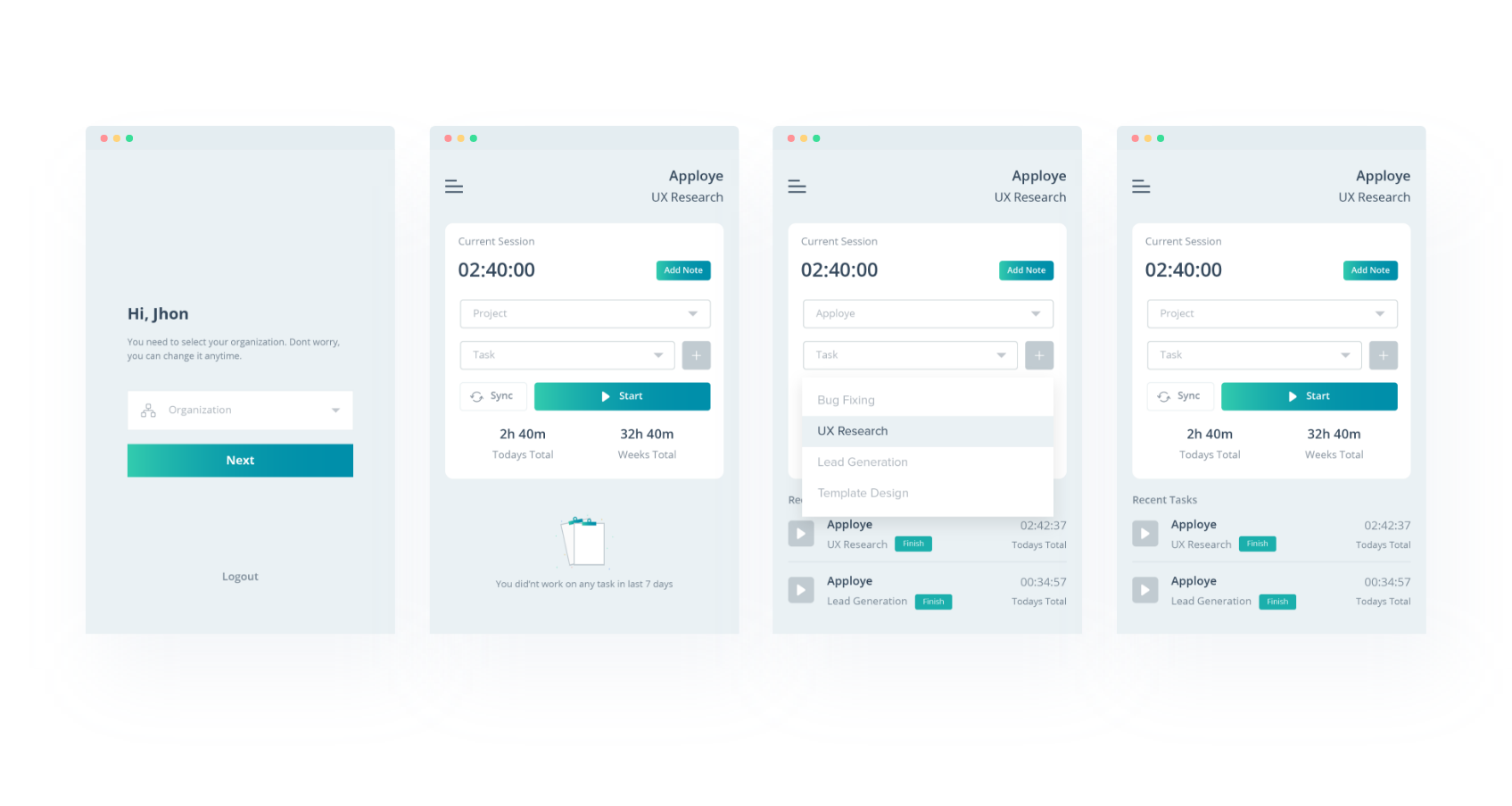
Before an user starts tracking time, an user needs to be login on a particular organization. The home screen has a Current Session panel where an user will select project and task and just start tracking time. This desktop app can run offline and it can sync tracked time to the web application we built.
Additionally, users will be able to add notes on a particular time and the total time will be shown underneath the Start button. A comparison of today’s total and weekly total is shown.
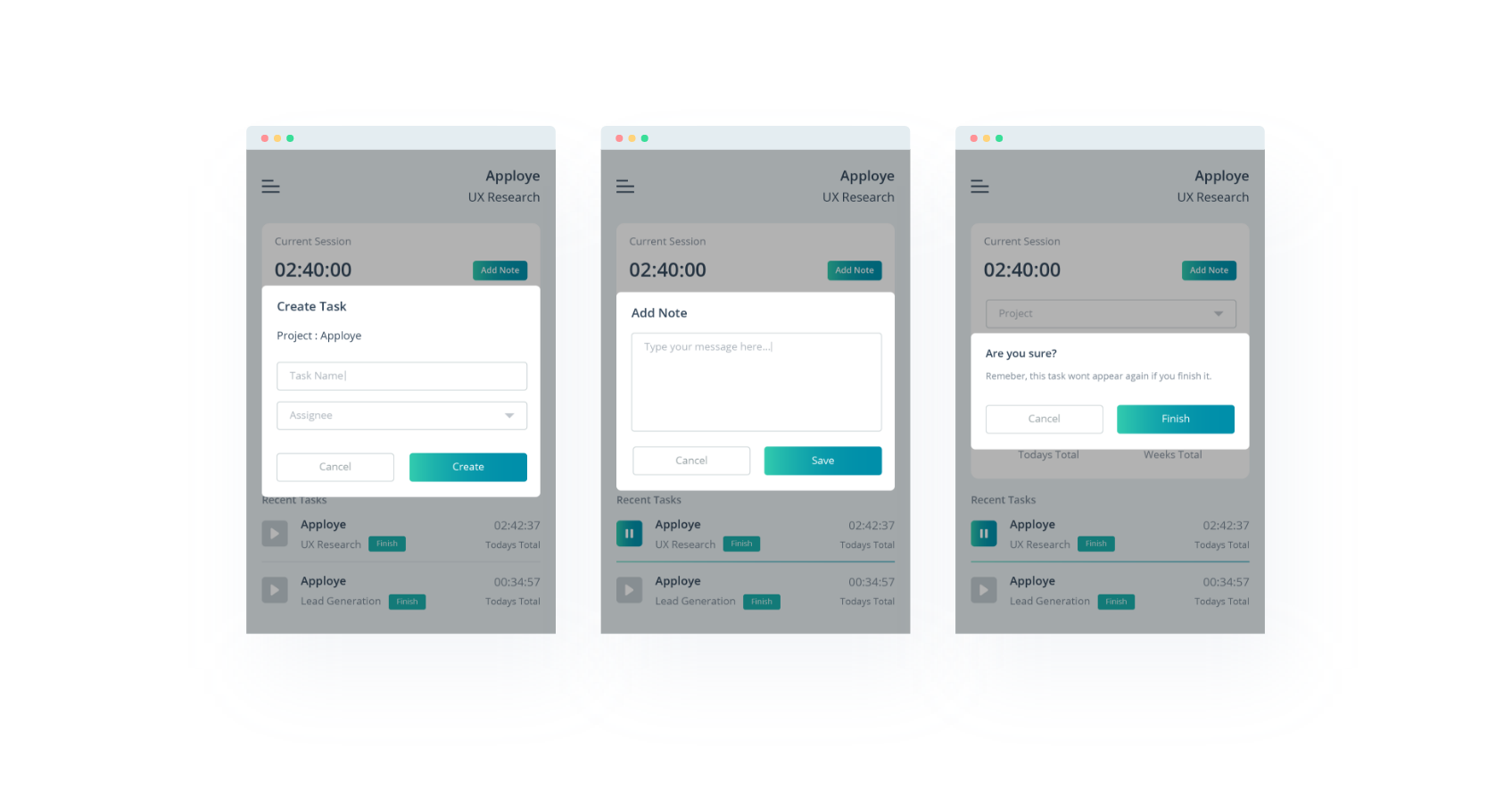
All the popup messages are shown above which includes task creation, adding notes and finishing tasks. Creating a new task and starting tracking time on that task is way more easier than the previous version of Apploye desktop application. A task can be finished by the application.
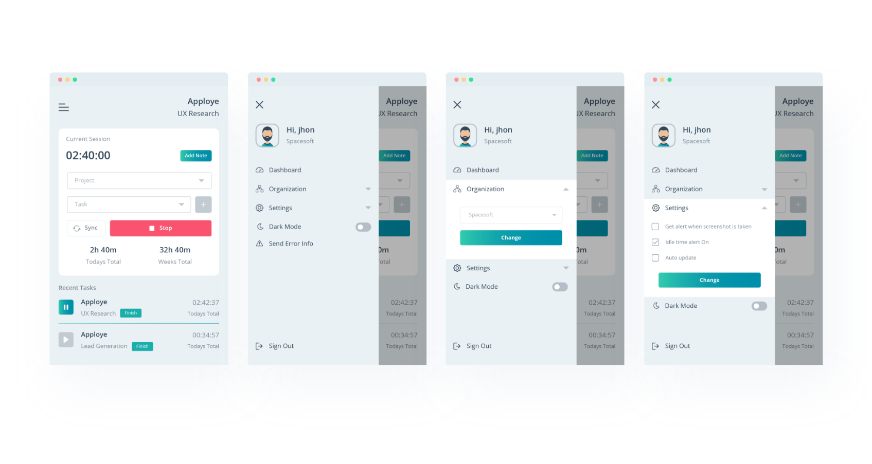
The application has a navigation drawer which has some basic functionalities. Users organization can be switched and a user will be able to control some features about taking screenshot alert, idle time alert & about updates.
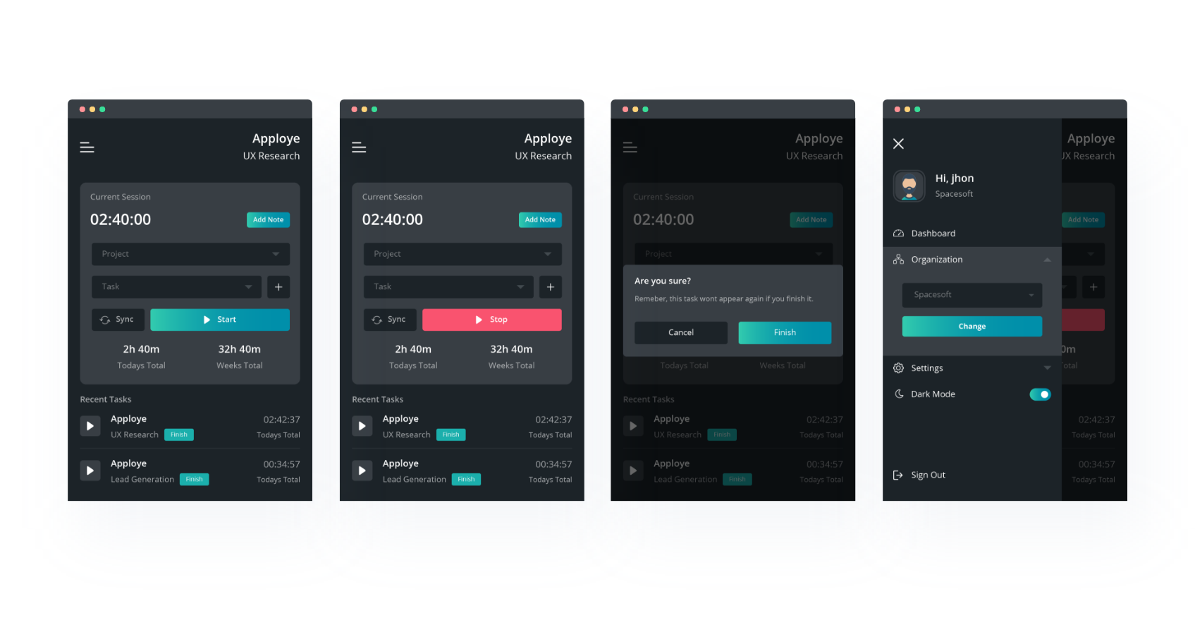
For light sensitive people out there, Apploye desktop application has a dark mode screen feature.
This desktop application is ready for your favorite devices.

Let’s take a look on what people think about Apploye now
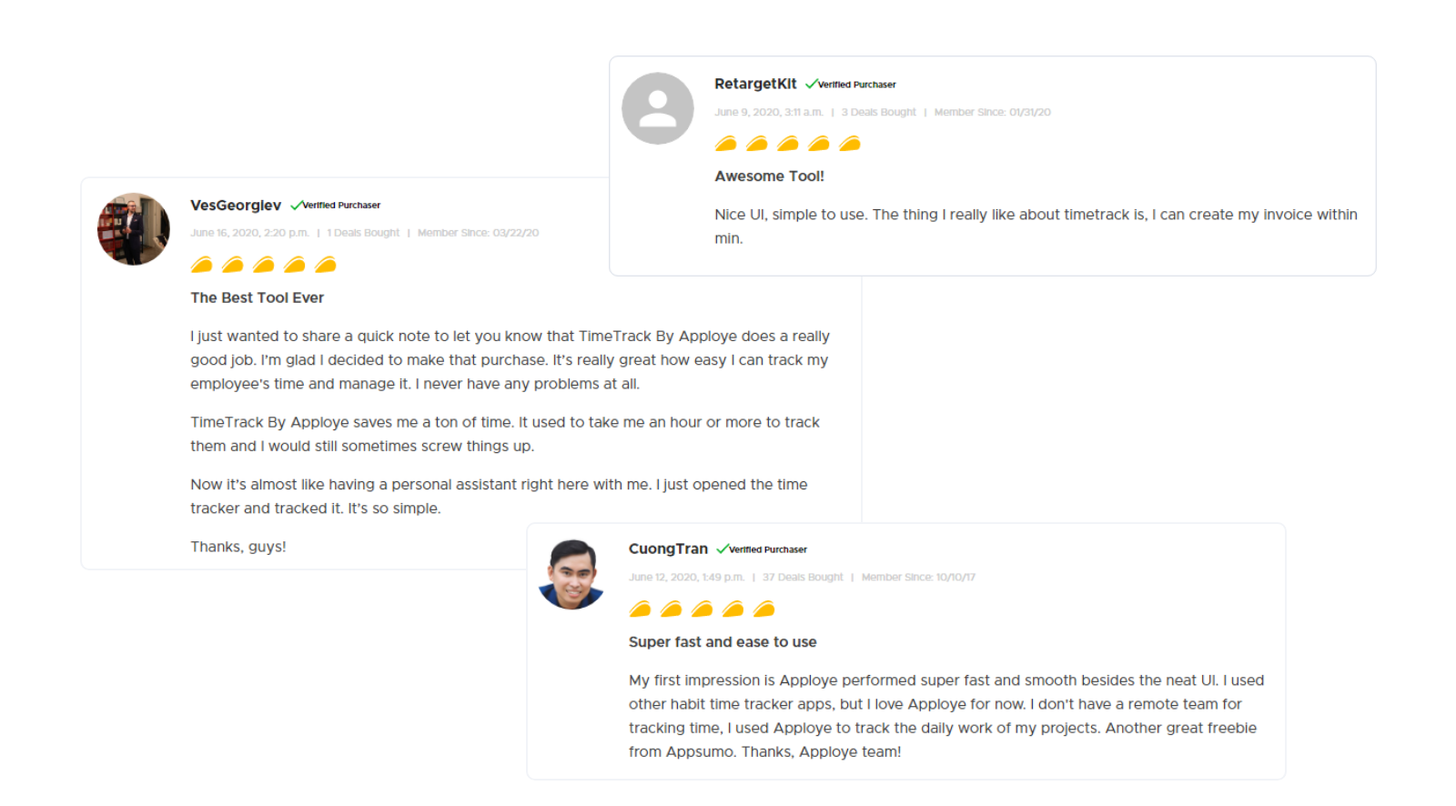
It’s our comfort that we are building trust amongst the users around the world.
Finally, it’s been an amazing journey from designing this application to deploying to the end-users. Apploye is now one of the top time tracking applications which has earned love from their users worldwide.
Read our other articles and visit our blog here. Read about the world’s best time tracking applications for windows and mac.
Thank you for taking time reading all of these!
